As a small business owner, do you ever feel like your brand is just a little, well, flat? It’s my nightmare, and also without a doubt my biggest stumbling point when executing a brand identity. That’s where brand textures and patterns come in.
Patterns and textures are the surfaces of your brand. They provide a base upon which you can pull together your brand elements, as well as a literal background for websites, stationery and photography.
Defining the textures and patterns of a brand is incredibly important, but in my experience, it’s also the most forgotten element of a brand identity. You probably have a pretty solid idea of these elements are for your small business, but might not have taken the time to document that pish.
Well do it now grrrrl (or guy or person).
Patterns vs textures
There is no law that says your brand surface should be patterns or textures, but my personal preference is to pick just one for the core of your brand. Using both can be just too much, and lead to a finished product that loses impact by over-stimulating.
There’s also a practical reason for choosing textures or patterns, and that’s for online use. The internet isn’t visceral, and so any textures used are at a technical level, patterns themselves. I find that if a digital pattern recreation of a physical texture sits next to true pattern, the textured background looks fake AF.
Examples of brand textures
When developing the brand identity for Studio Cotton, I wanted to focus and enhance the physical elements. The products we sell are digital or strategic, so technically we have absolutely no need for anything ‘real’.
However, the services and relationships are incredibly personal, as we work very closely with the owners of small creative businesses.
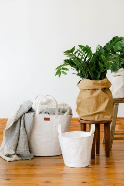
That’s why I like to go all-out on the texture front, and why I spent £500 on ludicrously fancy business cards. We need to add a human touch to an otherwise remote industry, and so our brand textures are recycled paper stock, cosy fur blankets and natural light wood.
These textures run through our stationery, photography and the decor of our physical spaces. Here’s a few texture ideas for your touchy-feely identity:
- Kraft paper
- Marble
- Terrazzo
- Plaster
- Ceramic tile
- Peeling paint
- Velvet
- Bamboo
- Leaves
- Petals
- Paint strokes
- Watercolours
- Inks
- Sand
- Pebble
- Concrete
- Water
- Brick
- Sky
- OSB
- Floorboards
- Reclaimed wood
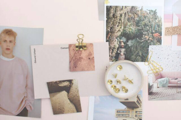
Pattern for brand identities
I love brands with patterns at their core. Heck, we used to have a whole Pinterest board dedicated to brand patterns, which acted as a key part of our brand identity project briefing process when that was a service we offered.
But here’s another reason why I didn’t choose the pattern route: it can be really quite expensive. A gorgeous, custom pattern needs to be created with care, preferably by someone with experience in creating patterns for commercial application.
There are more cost effective routes using simple patterns and stock vector patterns. Anyone can create their own pattern using ridiculously online pattern makers like my fav, Pattern Ninja.
A much more common solution is the stock vector pattern, available from usual stock image sources like Shutterstock and Creative Market. These pattern elements are available to anyone for a fixed price, and generally aren’t the place to go if you’re looking for something super specific or original.
They are great for timeless patterns though, and a great way to source the classics like damask, geometric, spots and memphis patterns for a lively identity.
If you want to see an incredible example of pattern in branding, I always recommend Birch Box. Every one of their subscription boxes is accompanied with a stunning original design which in turn gives each month its own identity.
This article is part of our September 2018 challenge: 30 five-minute tasks for marketing a small brand. Check out our blog for more, or follow Studio Cotton on Instagram for more tips and lots of small business advice.