Why is it so important to have professional product images you ask?
Well, let me tell you. Great product photography helps your brand to stand out, it’s more engaging, and ultimately it draws the attention of your clients. After all, we’re such visual creatures and we surround ourselves with pretty things all the time, so why not make sure that your product images are equally just as amazing.
As well as my work at Studio Cotton, I’m a product and lifestyle photographer for sustainable and creative businesses. I help small and often local brands to elevate their online presence through beautifully styled images and engaging content.
There’s so much you can say with your small business product images, so choosing your props carefully and knowing how to style your photos is super important.
A few weeks ago, we put an Instagram post out to see if any of our followers would be interested in giving some of their product shots a little makeover. There were so many indie brands to choose from, but I narrowed them down to these 6 lovely small business owners, and I will show you how I improved their product photography.
Disclaimer: I was meant to only take one image per maker but that is not in my nature – I overshoot, and it’s no secret that I simply cannot just take one shot.
The rule of thirds for Penny Spooner Ceramics
Penny is a pottery designer and makes fine wheel thrown delicate porcelain tableware from her studio in Hampshire.
Before product shot by Penny Spooner Ceramics
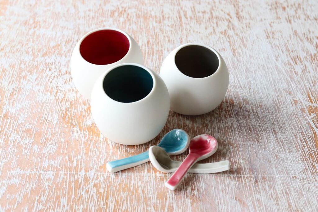
First up is Penny with her beautiful handmade ceramics. She’s created a lovely and simplistic photography set up (my favourite!) clearly showcasing her product in three different colour variations. By not using any props, the focus is on the product, and there’s nothing that would distract us from it. Technically, the image doesn’t need much else.
However, there are a few things I’d like to play with to make sure the image is speaking for the product, and ensure that it’s attracting as much customer attention as possible.
What I’d like to do is to bring a little bit more interest to the image, by creating a more dynamic set up, adding some lightness to it and making it stand out.
After product shots by Weronika Karczewska
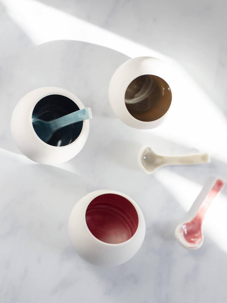
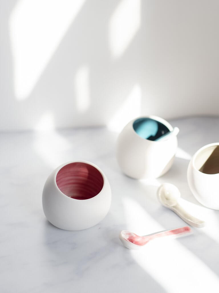
The Penny Spooner Ceramics photography makeover recipe
- I swapped the background colour to a lighter one – this helps to bring out the delicate, round properties of these dishes, and it’s much softer and gentler on the eye.
- I added a bit of a scandinavian touch to create a modern, fresh and contemporary lifestyle shot.
- I used shadows to add a more dynamic interest to the image.
- By using the rule of thirds, I was able to place the product in areas that are most likely to draw the viewer’s attention.
Follow Penny Spooner Ceramics on Instagram
Like Penny Spooner Ceramics on Facebook
Visit the Penny Spooner Ceramics website
Shop Penny Spooner Ceramics on Etsy
Lifting with light for Carissa Tanton
Carissa is an illustrator from the beautiful North Wales, living between the sea and the mountains. Her love for simplicity comes out in a lot of her work where she primarily uses black and white for her lovely art pieces.
Before product shot by Carissa Tanton
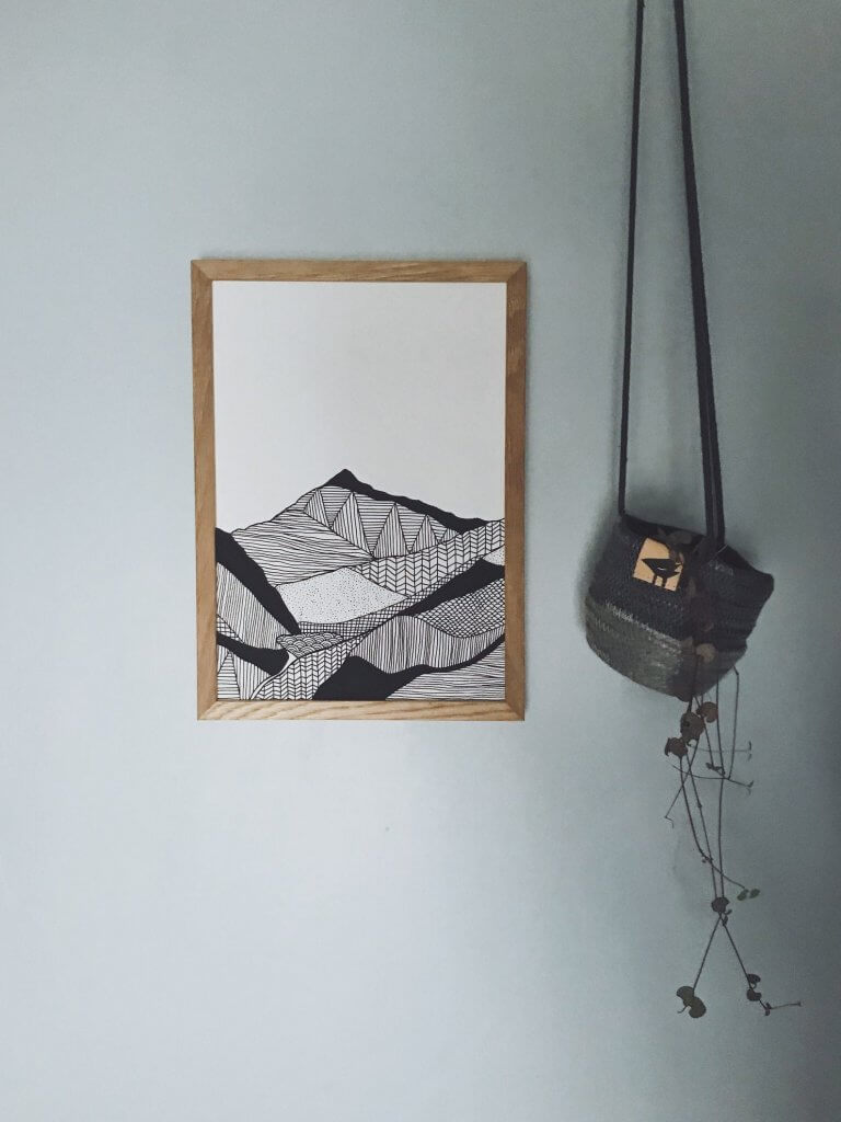
What I really like about Carissa’s image is the fact that she had placed the product where you’d normally find it. Hanging a print on a wall, putting a coffee mug on a table with some lovely books around it, or placing a candle on a lovely tray with some flowers next to it are all great ways to make your products come to life – this will help your customer visualise the lifestyle it could give them.
The main thing I’d like to improve in this product shot is the lighting – I want to make the overall look brighter, so you can see the whole scene clearly.
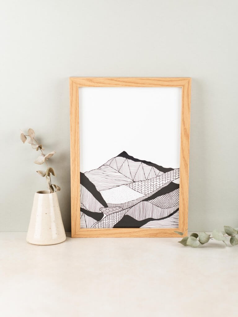
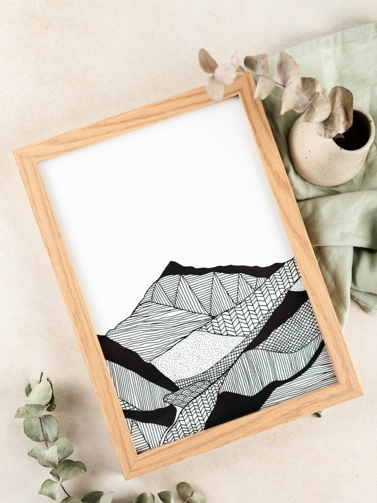
After product shots by Weronika Karczewska
The Carissa Tanton photography makeover recipe
- I focused on bringing more light to the image. The original photo is quite dark, so I shot this one with some studio lights to make it come alive. If you don’t have access to studio lighting, you can also brighten up your images with some foam boards. Make sure you shoot your images by a window and place the foam board directly opposite the light source – this will bounce back the light making your overall photo much lighter.
- I wanted to keep the greenery in the photo, but instead of a hanging plant, I’ve decided to go for some dried foliage.
- I took out the glass from the frame to avoid any reflections when shooting.
- I created a flat lay shot to show the product from a different angle.
Follow Carissa Tanton on Instagram
Visit the Carissa Tanton website
Shop Carissa Tanton on Etsy
Finding Balance for Dakota Rae Dust
Bec makes handmade colourful statement jewellery and accessories from her home studio in Bristol. Her amazing products pair bold vinyl prints with vintage and recycled fabrics, which she sources from charity shop sale rails, recycling centres and house clearances.
Before product shot by Dakota Rae Dust
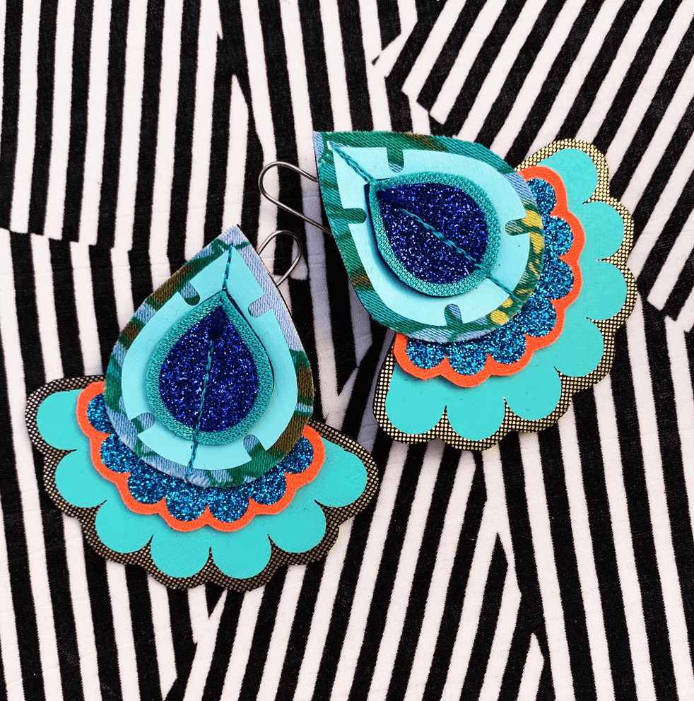
Bec’s statement earrings are truly amazing, and I love that her product shot is bold, playful and conveys a lot of her personality. She paired up her vibrant earrings with a black and white striped background for a high contrast image, however, the lines can be slightly distracting and take away the focus from the product. To make sure the earrings stand out, I wanted to create something calmer, while keeping Bec’s love for pattern in my recreation.
After product shots by Weronika Karczewska
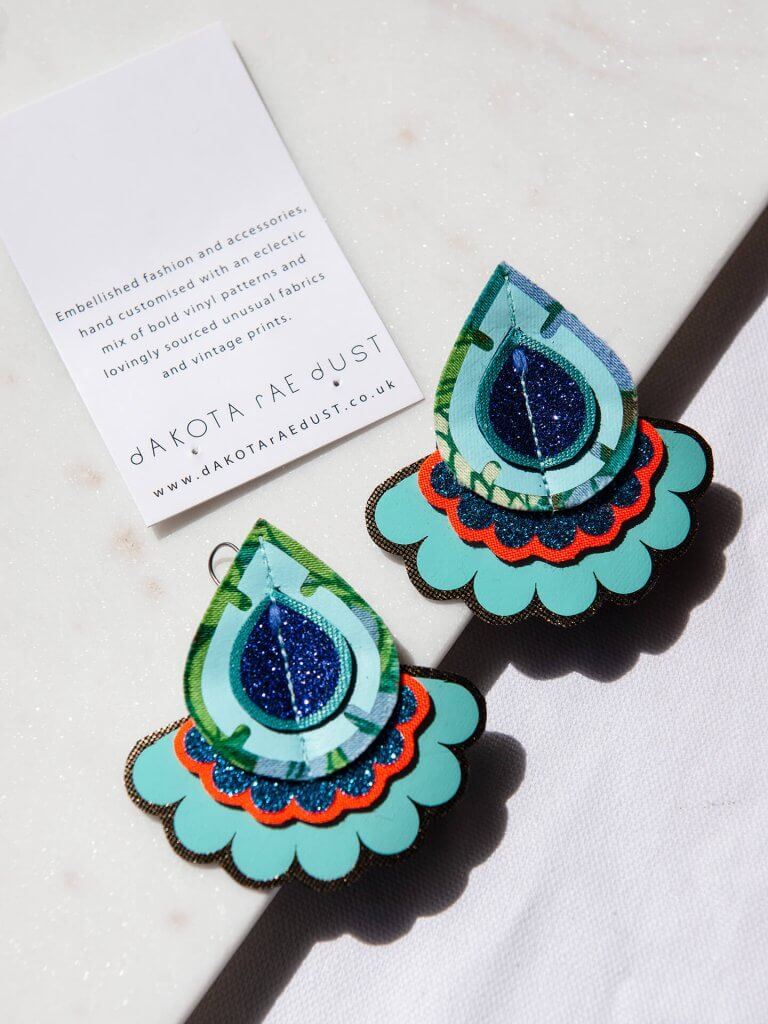
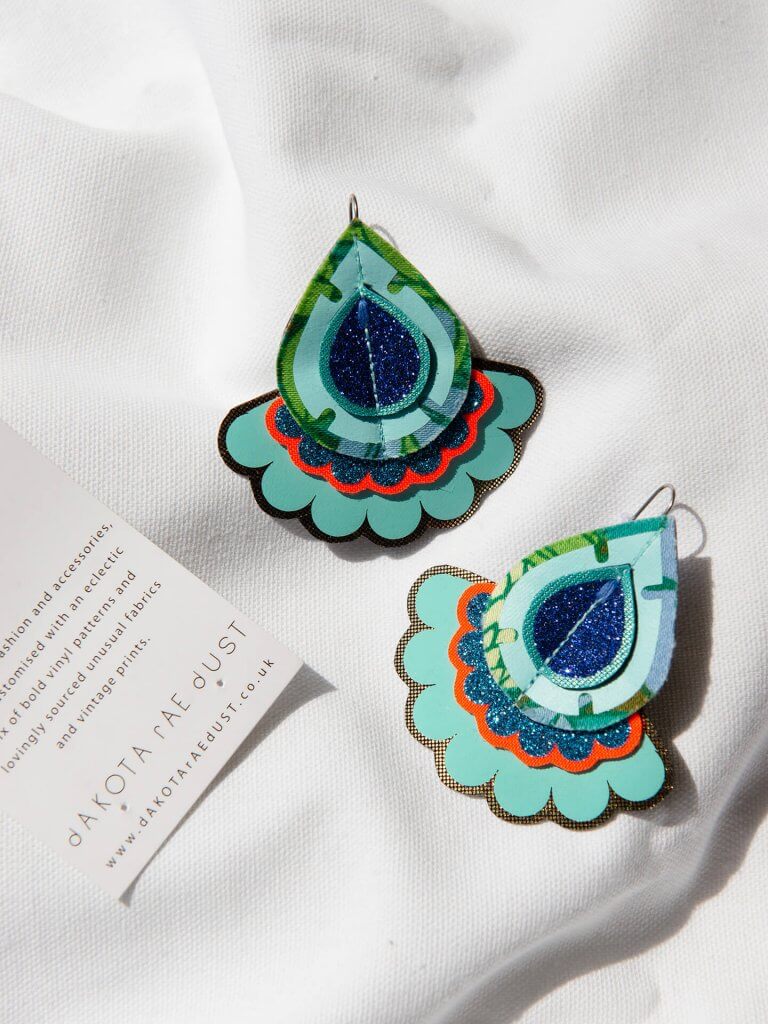
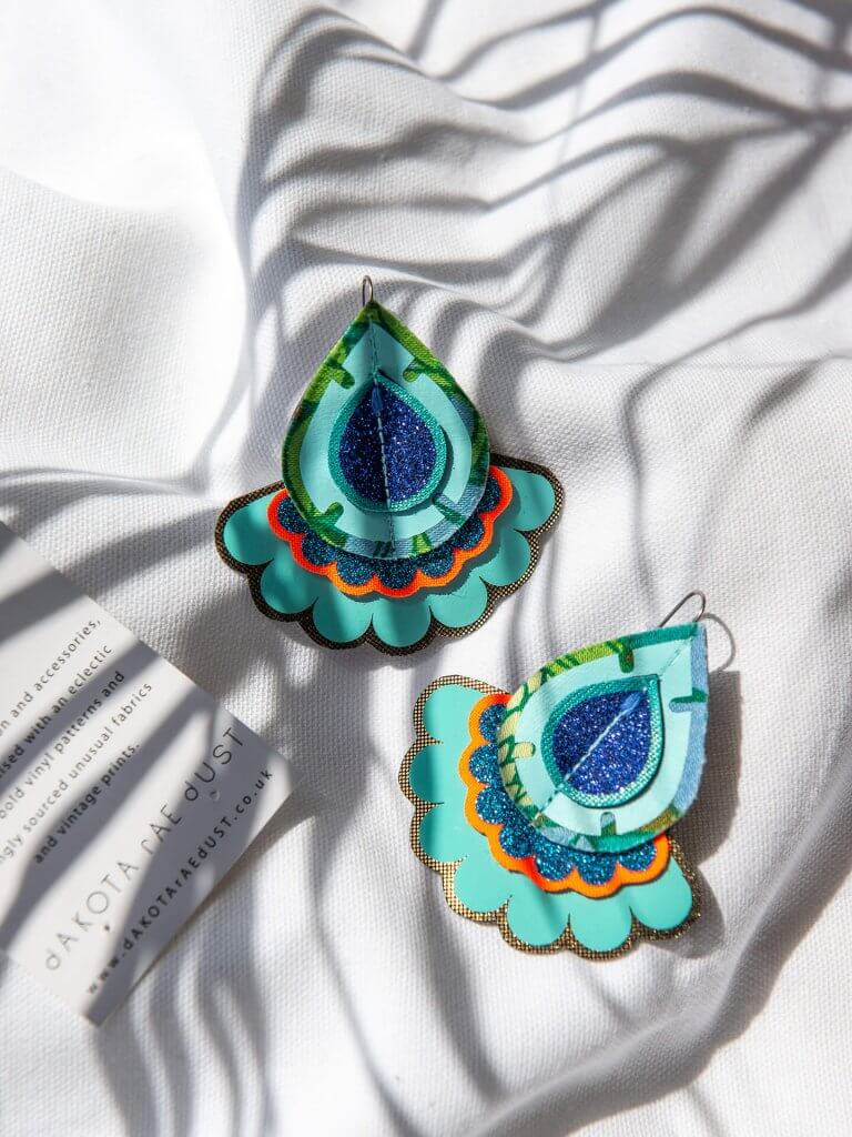
The Dakota Rae Dust photography makeover recipe
- I started off by simplifying the background by using a plain tablecloth as a base for my image.
- I wanted to keep Bec’s love for pattern in my image, so I decided to create lines with shadows coming through my window. To create those I folded up some of the fabric, used a leaf above my image to get some shadow lines, and I propped the earrings on a rectangular tray, which added an extra shape to the image.
- I brought the saturation down ever so slightly – the colours are still bold and vibrant, but they don’t overwhelm the simplicity of the white background.
Follow Dakota Rae Dust on Instagram
Like Dakota Rae Dust on Facebook
Visit the Dakota Rae Dust website
Shop Dakota Rae Dust on Etsy
Adding sunshine for One Creative Cat
One Creative Cat is a Bristol based business, providing hand dyed yarn and knitwear accessories inspired by nature. They also create one of a kind bags and pouches by reusing and up cycling old fabric and yarn.
Before product shot by One Creative Cat
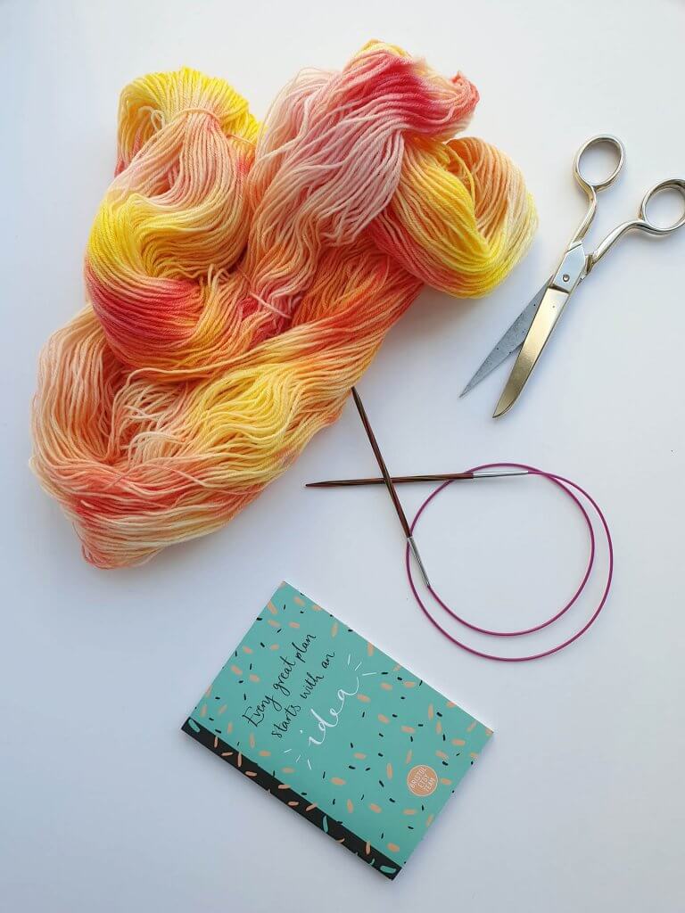
What I really like about Cat’s image is that she’s already paired up her product with some lovely yarn related props. This is a great foundation, and allows for building up a better understanding of the use of the product for potential customers. The main thing I wanted to change here is the colours. Cat’s yarn is a lovely vibrant sunshine-y colour, and I feel that it’s getting a little bit lost in the blue hues. I also wanted to add a few more props to create a lifestyle photography set up.
After product shots by Weronika Karczewska
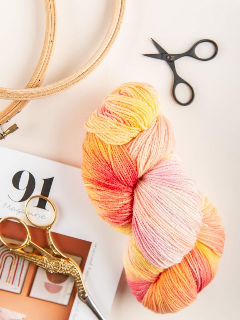
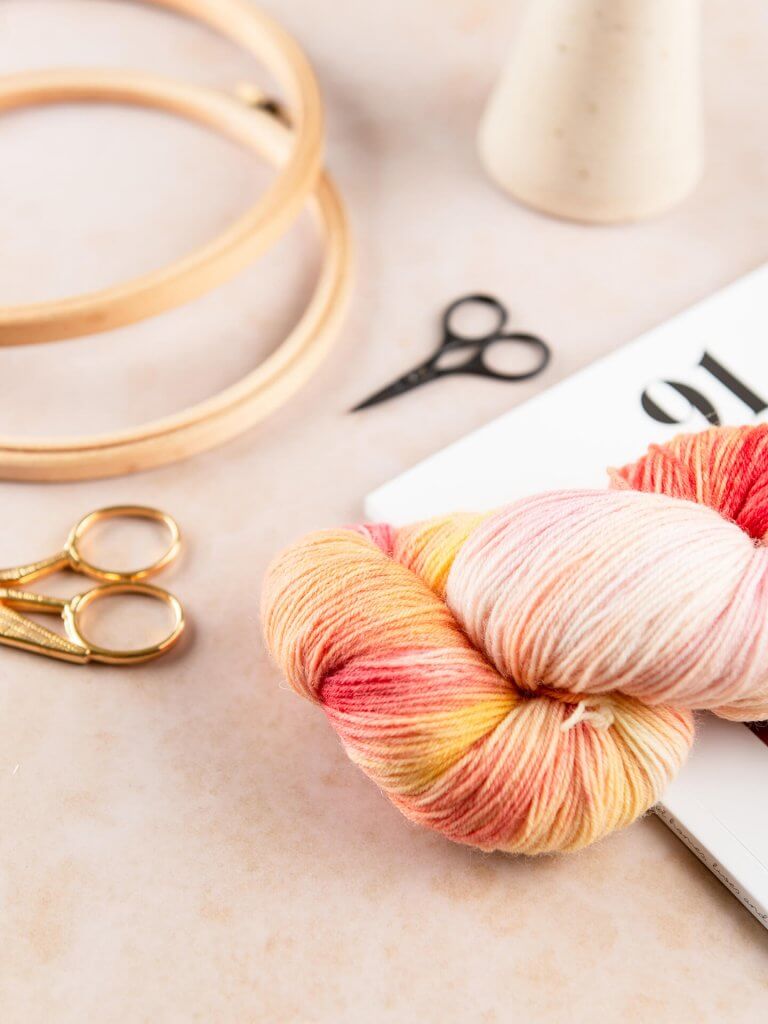
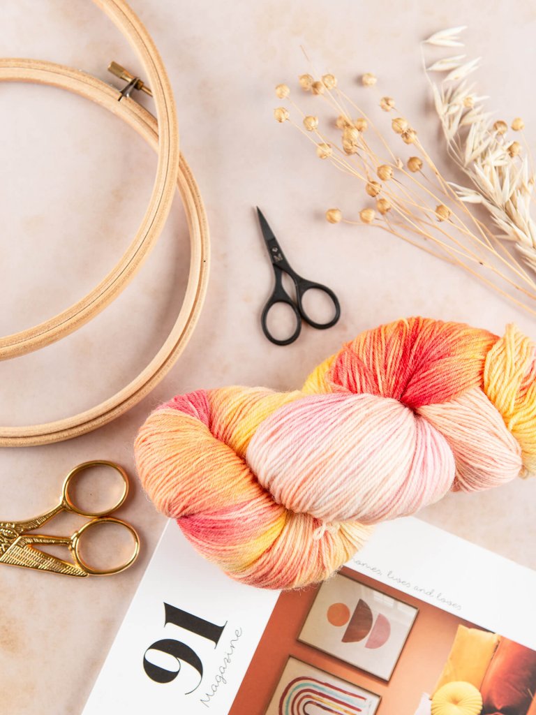
The One Creative Cat photography makeover recipe
- I removed the blue background, and decided to go with something that compliments the product and gives the overall image a warmer tone.
- I’ve also added more warm coloured props.
- I’ve added a few more crafty items to create more of a lifestyle set up.
- I kept the yarn in a hank to keep it looking neat.
Follow One Creative Cat on Instagram
Like One Creative Cat on Facebook
Visit the One Creative Cat website
Shop One Creative Cat on Etsy
Mindful moments for Forest & Sage
Next up is a photo from Lizzie, who runs Forest & Sage, a natural and organic skin care brand in Yorkshire. These lovely pots of joy are all about celebrating self care & mindful moments, and I wanted to make sure I do exactly that with my images.
Before product shot by Forest & Sage
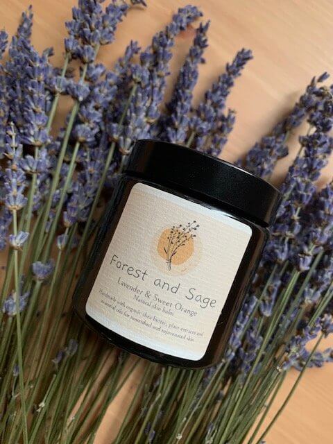
Lizzie has picked out a key ingredient from her product and used it as a photography prop, which is great for letting your customers know what can be found inside the tub. This works really well especially with beauty products, candles and food & drink, because we want to know what we’re buying into. What I’d like to change in this image is the general “feel” of it – I’d like to make it look more at-home-spa like, and create bright and airy images that invite you to have a calm moment of stillness.
After product shots by Weronika Karczewska
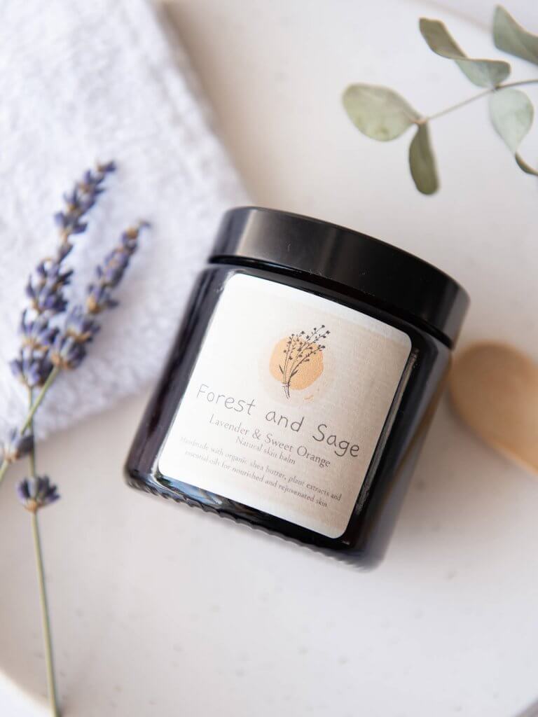
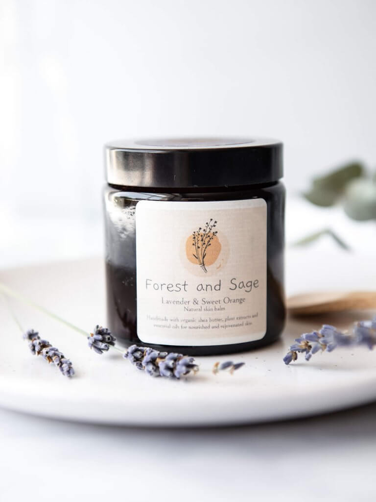
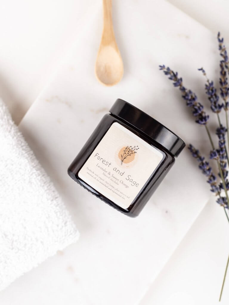
The Forest & Sage photography makeover recipe
- I’ve swapped the orange wood backdrop for something much softer and lighter – this allows the product to stand out more, and to feel more delicate and gentle.
- I’ve added some props such as marble tray, face cloth and a small wooden spoon to create a self care / spa atmosphere, to embrace the intended use of the product.
- I’ve reduced the amount of lavender used in the image to give it a gentle hint of the ingredients, without being too overwhelming.
- I also added some shapes, like trays and plates, to add more depth to the image.
Follow Forest & Sage on Instagram
Hollie Alexa Moxham
Onto the last but not least, Hollie is a designer, illustrator and writer based in Bristol. She also runs a small online store selling prints, cards and stationery, and writes a blog supporting and celebrating small businesses and female founders.
Before product shot by Hollie Alexa Moxham
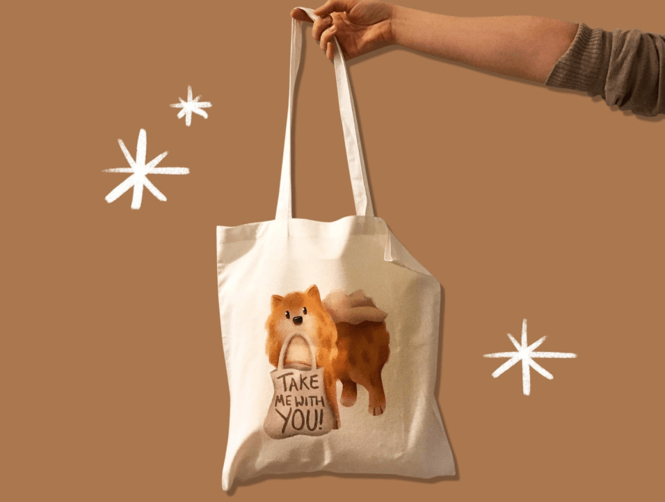
This was a real tricky one. If you have ever tried to photograph a tote bag, you will know it’s not an easy task. Hollie has done a great job by using a hand to hold the bag – this adds a lifestyle element to the shot, and makes it more interesting and engaging. She’s kept the overall image quite minimal and simplistic, which is exactly what I’m going to mimic in my take on this particular shot. The original image has a saturated, graphic feel to it which unfortunately affected the design on the bag, making it look darker than it is in real life.
After product shots by Weronika Karczewska

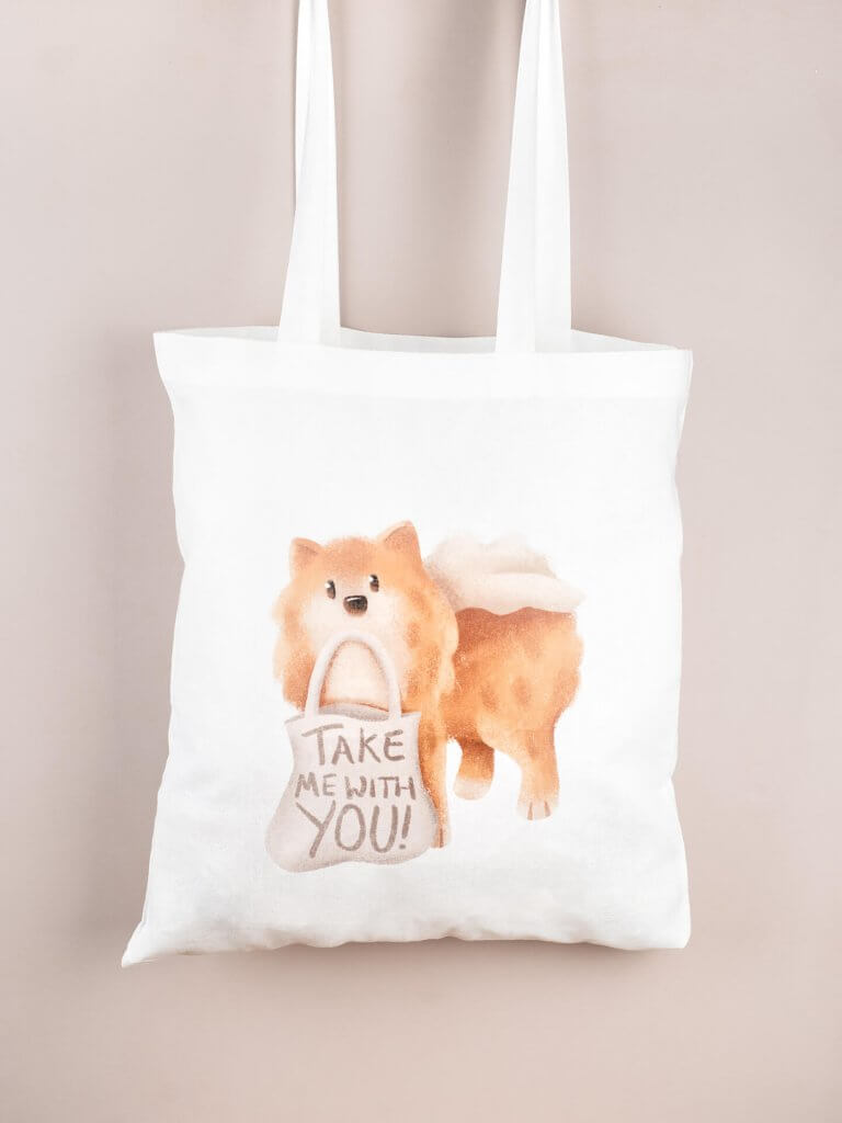
The Hollie Alexa Moxham photography makeover recipe
- I shot the image with studio lights to get the exact colours of the design.
- I used a backdrop colour which compliments the bag.
- I stuffed the bag with some filling to get the shape of the bag.
- I decided to crop off the hand, and instead have a clean image of the bag on its own.
Follow Hollie Alexa Moxham on Instagram
Like Hollie Alexa Moxham on Facebook
Visit the Hollie Alexa Moxham website
Shop Hollie Alexa Moxham on Etsy
So there you have it, the very first edition of Before & After product photography makeover. I hope it encourages some lovely small businesses to make a few tweaks to improve their product photography, sometimes it’s the smallest things that can make the biggest difference.
For more product and lifestyle photography visit my website and follow my Instagram.
And if you’re looking for a few more simple tips on how to improve your product photography (especially for Instagram), Aime wrote another blog post on that exact topic last year.